Friday, 22 March 2013


The left third of my magazine
The left third of the magazine, is one of the most important parts of the magazine, as it is what people will see when they are buying the magazine in the shop.


Here is the centre third of my magazine! i think it is good because you can instantly recognise the title, as being maverick, it gives you a few ideas of whats to come, and it also shows the appealing price!

Images used!

This image also was edited very well, its not until you put the images side by side, that you can actually see the real quality of the editing.


Here show the image of the guitair, to incorporate music more into the music magazine. I decided to cut it out, because the carpet doesn't look very good against the back of this image. i done this using the lasoo tool.


Overall i have used a variety of shots. I have used a close up of Bonnie, where her hand is covering her mouth, i like this image as you can see her fun side, and the reader can connect with her, and see that she can have a laugh. The other images on the double page spread are both medium shots. I like the one of her singing, because it shows what she actually does, it doesnt just describe that she's into music, it shows the reader also. The other image of Bonnie i also like because it shows a more posed shot, so that the reader can see that they do this alot.
Wednesday, 20 March 2013


Working progress: dps

Here show the images
I used of bonnie. To make these look more like they were in an magazine, i
added a light pink border. I like this as it links the whole page together,
using house style and similarity in the colours chosen.

Here shows my double
page spread article, i am extremly happy with the outcome. I only had to play
around slighly with the components to make them fit on the page correctly. The
final composition i have achieved i feel looks like the layout of a real
magazine.


Working progress: dps


Here is the white text box i was talking about in an earlier post.
Double page spread - Starting to add images

The double page spread features a large image of Bonnie. I love this picture! I think you really can see that the contents, dps, and front cover relate due to all of the colours!

Double page spread: Bonnie image edited

Firstly i slightly edited this image of bonnie, i painted her nails in to make them fit with the page colour theme. I also added a lighter colour on each of the nails to look like they were painted, and that they were reflecting light.
Later on i also done the same thing i done with my image on the front cover, and made her pupils larger, and gave more light spots in her eyes to make her look more friendly. I also added a tan, and some eyeliner around the eyes.
Questions for my double page spread
I decided to write up the questions in a word document before hand, and i asked Bonnie these, and i asked her to pretend as if she was actually this vintage starlett, and i expected her to react to the questions as she would if she was a star!


Working progress: finishing off

As you can see i have added all the page numbers, and stuck to my draft with regards to the fact they are all alternating sizes! I also have included the www.maverick-mag.co.uk part to form convergence with the audience.
I have also added images, however one thing i haven't done yet is added page numbers, to direct the images to the articles they belong too.
Working progress: adding page numbers


You can see that if the contents is page 1 then the other pages on the left will be even numbers, and on the right of the magazine are always odd. So i released i needed to make the DPS, an even number on the contents, however it will be 2 pages, which will take up an odd number also.
Another thing with page numbers, is that in magazines they don't feature these on every page. However for my double page spread i feel it is vital, as i want people to be able to find it as easy as they can see the page number.

Working progress: continued
Here shows the articles arranged how I would like them to be :


after this i decided to move some of the articles around, so there was less blank space.
Working progress

Working progress: adding more to the magazine

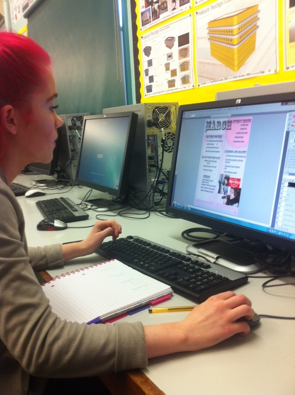
Working progress: starting my contents page

The black orginal title colour, i personally thought looked too harsh for my magazine, so i decided to make it a greyer tone, i still wanted it to look dark, however i wanted it to be slightly more subtle and blend in almost with the background. Below is what it looked like.


I have added light
pink boxes, this is to put my main articles in so there is a collumn like
structure happening. I also have used a spray paint sorta effect to make some
texture on the page, this works very well on the top baby pink circle.
Subscribe to:
Posts (Atom)