Friday, 22 March 2013


The left third of my magazine
The left third of the magazine, is one of the most important parts of the magazine, as it is what people will see when they are buying the magazine in the shop.


Here is the centre third of my magazine! i think it is good because you can instantly recognise the title, as being maverick, it gives you a few ideas of whats to come, and it also shows the appealing price!

Images used!

This image also was edited very well, its not until you put the images side by side, that you can actually see the real quality of the editing.


Here show the image of the guitair, to incorporate music more into the music magazine. I decided to cut it out, because the carpet doesn't look very good against the back of this image. i done this using the lasoo tool.


Overall i have used a variety of shots. I have used a close up of Bonnie, where her hand is covering her mouth, i like this image as you can see her fun side, and the reader can connect with her, and see that she can have a laugh. The other images on the double page spread are both medium shots. I like the one of her singing, because it shows what she actually does, it doesnt just describe that she's into music, it shows the reader also. The other image of Bonnie i also like because it shows a more posed shot, so that the reader can see that they do this alot.
Wednesday, 20 March 2013


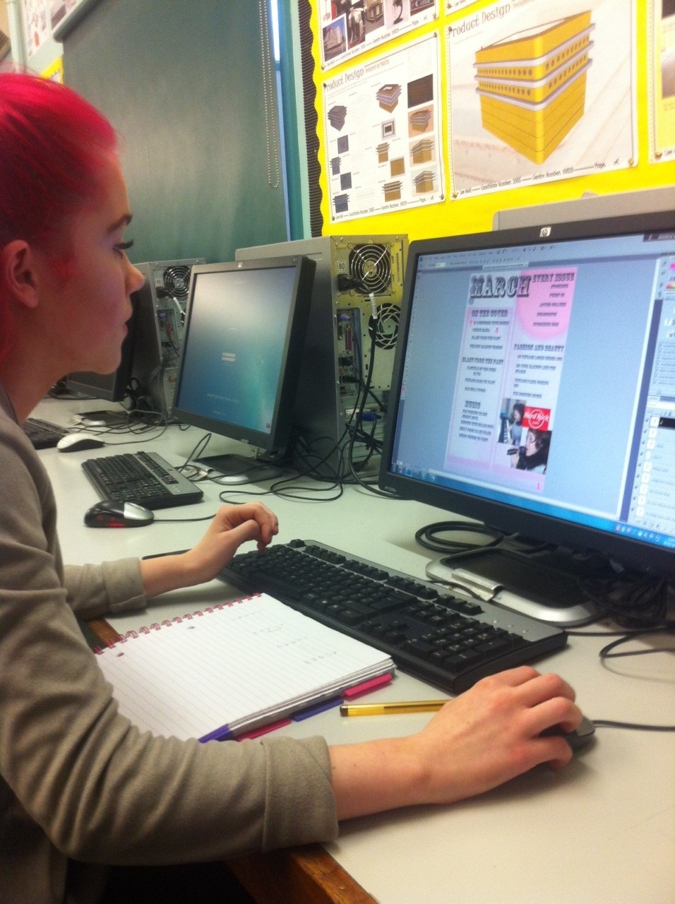
Working progress: dps

Here show the images
I used of bonnie. To make these look more like they were in an magazine, i
added a light pink border. I like this as it links the whole page together,
using house style and similarity in the colours chosen.

Here shows my double
page spread article, i am extremly happy with the outcome. I only had to play
around slighly with the components to make them fit on the page correctly. The
final composition i have achieved i feel looks like the layout of a real
magazine.


Working progress: dps


Here is the white text box i was talking about in an earlier post.
Double page spread - Starting to add images

The double page spread features a large image of Bonnie. I love this picture! I think you really can see that the contents, dps, and front cover relate due to all of the colours!

Double page spread: Bonnie image edited

Firstly i slightly edited this image of bonnie, i painted her nails in to make them fit with the page colour theme. I also added a lighter colour on each of the nails to look like they were painted, and that they were reflecting light.
Later on i also done the same thing i done with my image on the front cover, and made her pupils larger, and gave more light spots in her eyes to make her look more friendly. I also added a tan, and some eyeliner around the eyes.
Questions for my double page spread
I decided to write up the questions in a word document before hand, and i asked Bonnie these, and i asked her to pretend as if she was actually this vintage starlett, and i expected her to react to the questions as she would if she was a star!


Working progress: finishing off

As you can see i have added all the page numbers, and stuck to my draft with regards to the fact they are all alternating sizes! I also have included the www.maverick-mag.co.uk part to form convergence with the audience.
I have also added images, however one thing i haven't done yet is added page numbers, to direct the images to the articles they belong too.
Working progress: adding page numbers


You can see that if the contents is page 1 then the other pages on the left will be even numbers, and on the right of the magazine are always odd. So i released i needed to make the DPS, an even number on the contents, however it will be 2 pages, which will take up an odd number also.
Another thing with page numbers, is that in magazines they don't feature these on every page. However for my double page spread i feel it is vital, as i want people to be able to find it as easy as they can see the page number.

Working progress: continued
Here shows the articles arranged how I would like them to be :


after this i decided to move some of the articles around, so there was less blank space.
Working progress

Working progress: adding more to the magazine

Working progress: starting my contents page

The black orginal title colour, i personally thought looked too harsh for my magazine, so i decided to make it a greyer tone, i still wanted it to look dark, however i wanted it to be slightly more subtle and blend in almost with the background. Below is what it looked like.


I have added light
pink boxes, this is to put my main articles in so there is a collumn like
structure happening. I also have used a spray paint sorta effect to make some
texture on the page, this works very well on the top baby pink circle.
What to feature in my contents page
Below are the articles i am going to feature in my magazine. I have divided them into 5 distinctive categorys.
On the cover - Most magazines have this, it is so that the consumer can acsess the stories that interested them on the front cover quickly, instead of searching through each and every page.
Blast from the past - This section is about the past and who most people would asdsume are the main vintage artists. Elvis will be the feature of this month, as many people inspire to be elvis, and are interested in his music and his overall story. In this section i have also included stories about Old hollywood, and the glamour of this time, and also the vintage cars that people see, want and love.
Every week - Most magazines i have noticed have this section also. This is what they feature every day and what people expect to see in this magazine genre.
Music - I have added this as a categroy on my contents as it is a very important feature in my magazine, as it is a music magazine. I have featured articles that have something to do with the musical side of my magazine, and also how people can get involved (by wining, or by visiting certain music venues).
Fashion and beauty - This section is for the inner girly girl in mavericks readership. This will tell them how to get similar looks to all the stars, and also how they can stand out from the crowd by adding modern twists.


Tuesday, 19 March 2013


Working progress - Barcode

Working progress - Adding coverlines

Working progress - Pupils and editing bonnie

The above picture shows the close up zoom, which i had to use to get the detail exactly correct. athough i have only added a line, it makes alot of difference when the picture is zoomed out. I have also made her pupils larger, and added more light specs on her eyes, this is to make her eyes look more friendly, and in this case i think it has really worked. I am not too happy on the lips in these images, however I will later fix these.
Working progress - Copyright

This just shows a copyright sign, i found this on the custom shape tool on photoshop. This is brilliant i feel because it makes my magazine look alot more proffesional.
Working progress : Front page construction

Working progress- Twitter bar
I have looked at different colours, that correspond to my house style. These are my final favourite two, however I feel that the lilacy shade will work better for my magazine, as it isn’t an overdose of pink, and is more similar to the shade of colour of my cover models dress.

What i want to feature in my front page!
Main cover articles
I have decided to feature the following articles (As shown in my draft)
"The new makeup trend"
This is again attracting my target audience, most typical girls like makeup, and they may or may not be interested in this article, however it is one of many, so i want to give them alot of choice in what they can read in Maverick magazine.
"All about Bonnie"
This relates to my main celebrity on the front cover. I am using this as the main article in order to anchor the image. This has to be done so that the audience know what the image is about, and if they are interested then they may want to read on, and more information can be giving by the images anchorage on the front page.
"Music Mania"
This is to relate my main page more to the music side of the magazine, because i don't want this to be non existance, as it is the brief for this task.
"Blast from the past"
This is looking at the vintage music side of my magazine, i want to interest the reader by finding out more about the actuall past, by giving them information on it.


My magazine: slogan/selling line
Most magazines have a selling line, as this basically is a small slogan which compliments the magazines title, and genre, and helps towards the selling of the magazine, and getting people interested. In the case of Maverick, i wish to use the following selling line :
"Standing out from the crowd"
This relates to my magazine title, "Maverick" and that people who read my magazine, will gain enough confidence, to want to stand out from the crowd for a positive reason, which may be their taste in music, or fashion sense.
"Standing out from the crowd"
This relates to my magazine title, "Maverick" and that people who read my magazine, will gain enough confidence, to want to stand out from the crowd for a positive reason, which may be their taste in music, or fashion sense.
My magazine: Colour scheme

My magazine: Audience profile

The targeted age of my magazine will be between 17-25. They will be people who have an interest in this type of genre. The magazine will be aimed at typical girls who enjoy hair and makeup, clothes and fashion, and vintage!! and of course the musical side of things also!
Gender
I may have initially wanted to target my magazine, at both genders, however i decided that i could make it easier by aiming it just at women and girls, because it is hard to satisfy both men and womens needs in one magazine. You do not see this done often.
Education
The people who read my magazine, will have an average education. It is not an advanced read, however it is not to the level of a 10 year old either, because some of the language and terms, may not make sense to younger readers.
Other interests
They will be interested mostly in vintage fairs, vintage life, vintage homes, vintage cars, vintage hair and makeup, people who have a vintage look nowadays, and basic the vintage lifestyle with a slight modern twist.
Lastly... Musical taste
Their musical taste will be music that is vintage, or music that has been remixed or changed slightly in order to create a contempoary look on vintage music. They will also like people who are doing this at the moment.
This is Lisa, she likes the vintage fashion, and also the music, with a more modern twist! She likes wearing polka dot, and full skirts, typical of the time. She likes to have her hair and makeup in the style of Marilyn monroe, and always looks sophisticated. Aswell as vintage, she is interested in typical girly things! She loves watching musicals, and enjoys Jersey boys, and dream boats and petticoats!

Subscribe to:
Comments (Atom)